
|
Typography is a way a written word looks. Typography is important because it shows clearly what you are trying to say with those words. The quote, "Each font has a personality and a purpose," means that each font represents something else. Sometimes depending on the situation some fonts won't look good with certain words, but others will look good. The five type of fonts we learned was: Serif: It has "feet" at the end of the letters. (newspaper) Sans Serif: It doesn't have "feet" at the end of the letters. (headlines, titles) Monospaced: Each letter takes up the same amount of space. (coding) Script: Looks like it is handwritten, hard to read. (logos) Display: A good attention grabber font. (games) Typeface ComparisonFor this assignment, we were asked to write the same word but in different types of fonts (Serif, Sans Serif, Monospaced, Script, and Display). In the screenshot below it shows the type of font and the name of the font. This is a screenshot that shows my work: 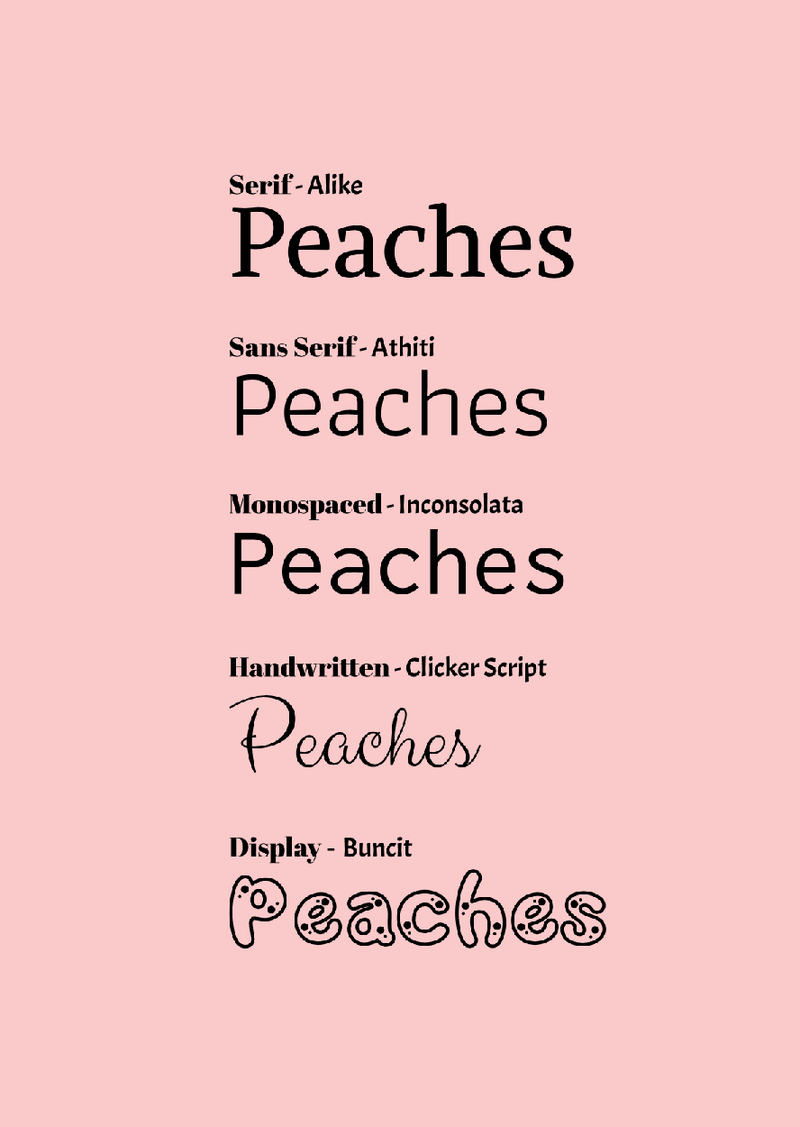 Word PortraitsFor this second assignment, we had to find 10 different fonts of our choice. After we found those 10 fonts we had to write 1 word that matches the font (on the left), and one word that didn't match the font (on the right). In the middle row I wrote the name of the font for each row. 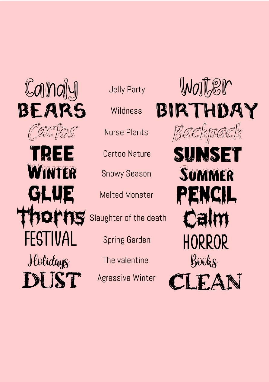
0 Comments
Leave a Reply. |
Archives
March 2021
Categories
All
 This work is licensed under a Creative Commons Attribution-NonCommercial-NoDerivatives 4.0 International License. |
