
|
In this assignment we were asked to make a unique logo. We were supposed to make one logo and then make 3 version making a slightly different version adding different colors. I used the pen tool to make the shapes and the pointer tool to make it more organized. One of the most frustrating part was that I didn't have enough space to put all the letters I wanted. I fixed the challenge by using the pointer tool to reshape the letters and make it smaller so that it can fit in. 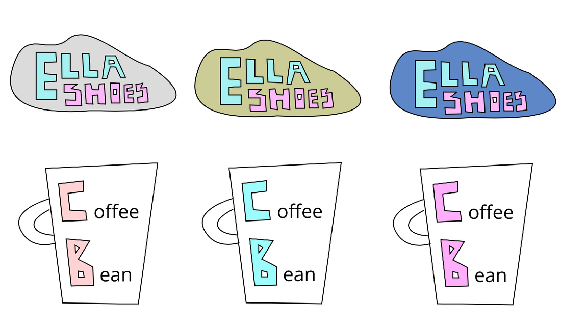 The name of my brand is Ella Shoes which is a brand that I made up. I decided to name it Ella Shoes because I really liked it and I thought it was very catchy. I also liked it because the design looked very neat and the colors matched very well. My brand is a shoe shop because I really like the idea of a shoe shop. The name of the brand (Ella Shoe) which is made out of the pen tool is inside of a shape that looks like a shoe that I also created with the pen tool. 
0 Comments
In this lesson we've learned all about the color theory. We learned about RGB and hex codes. In the first assignment called Color Names I made 15 triangles and put different colors to fill them in. After I filled in the individual colors in the triangle I put the hex code and the RGB on top of the triangle. For this work the top colors are the darkest colors and the bottom is the lightest color. For the second assignment called color schemes we had to use the website adobe color to come up with color palettes that include 5 colors with four color schemes - analogous, monochromatic, complementary, and triadic. These screenshots show my work for the two assignments. Color Names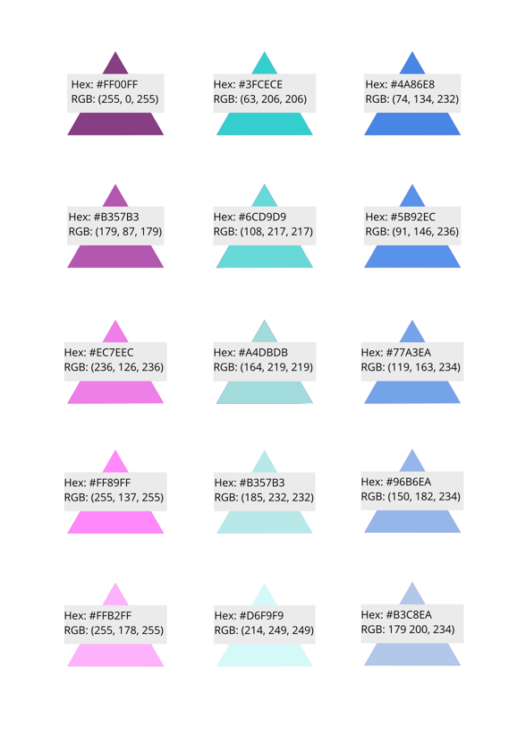 Color Schemes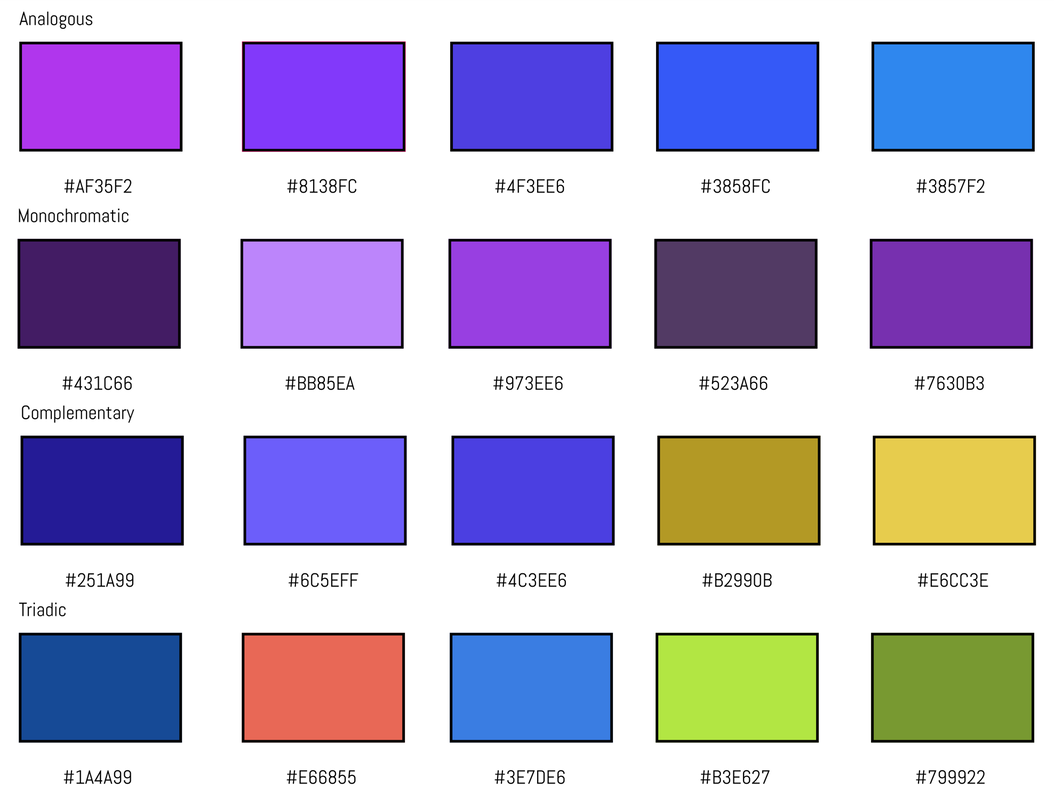 Typography is a way a written word looks. Typography is important because it shows clearly what you are trying to say with those words. The quote, "Each font has a personality and a purpose," means that each font represents something else. Sometimes depending on the situation some fonts won't look good with certain words, but others will look good. The five type of fonts we learned was: Serif: It has "feet" at the end of the letters. (newspaper) Sans Serif: It doesn't have "feet" at the end of the letters. (headlines, titles) Monospaced: Each letter takes up the same amount of space. (coding) Script: Looks like it is handwritten, hard to read. (logos) Display: A good attention grabber font. (games) Typeface ComparisonFor this assignment, we were asked to write the same word but in different types of fonts (Serif, Sans Serif, Monospaced, Script, and Display). In the screenshot below it shows the type of font and the name of the font. This is a screenshot that shows my work: 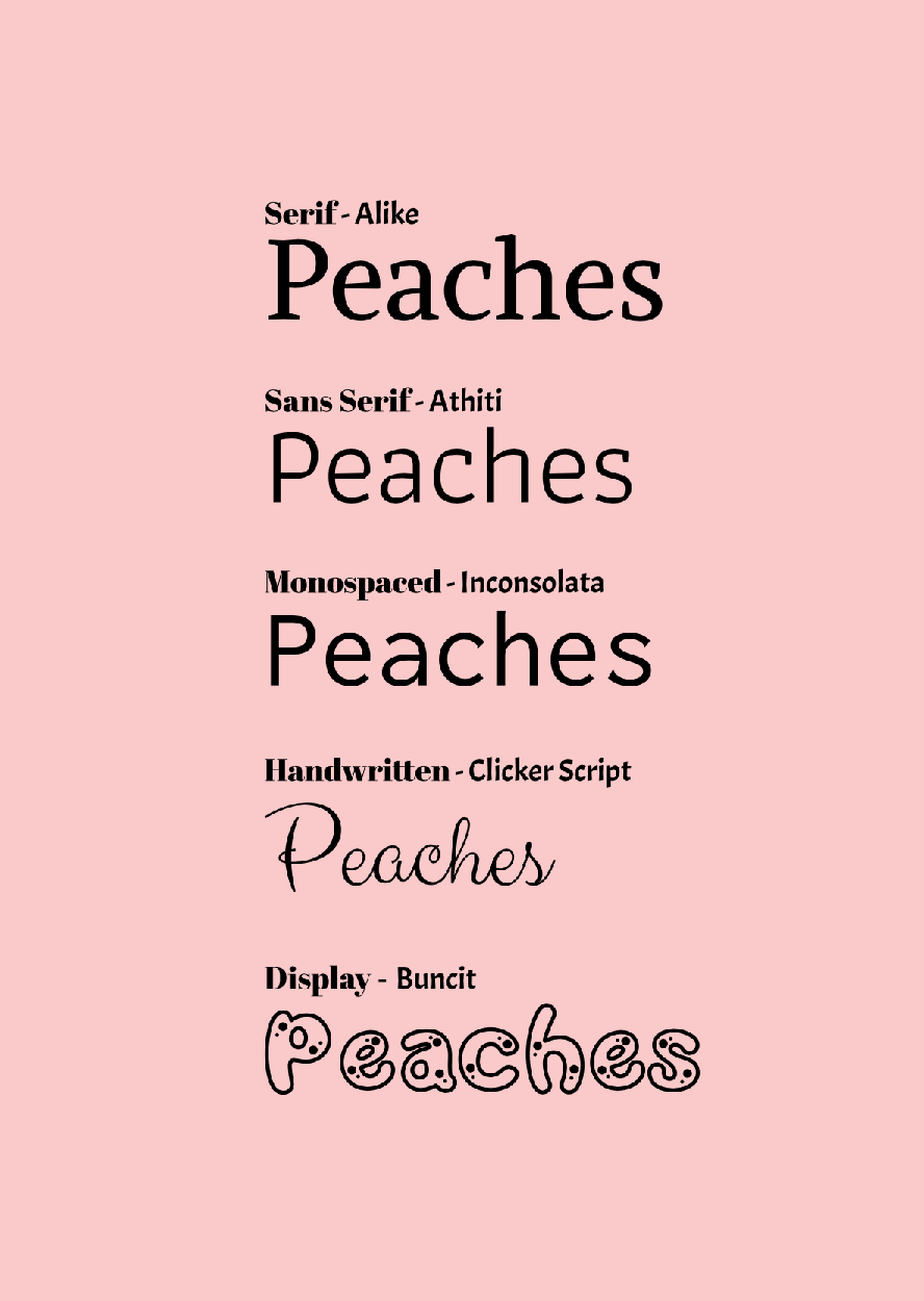 Word PortraitsFor this second assignment, we had to find 10 different fonts of our choice. After we found those 10 fonts we had to write 1 word that matches the font (on the left), and one word that didn't match the font (on the right). In the middle row I wrote the name of the font for each row. 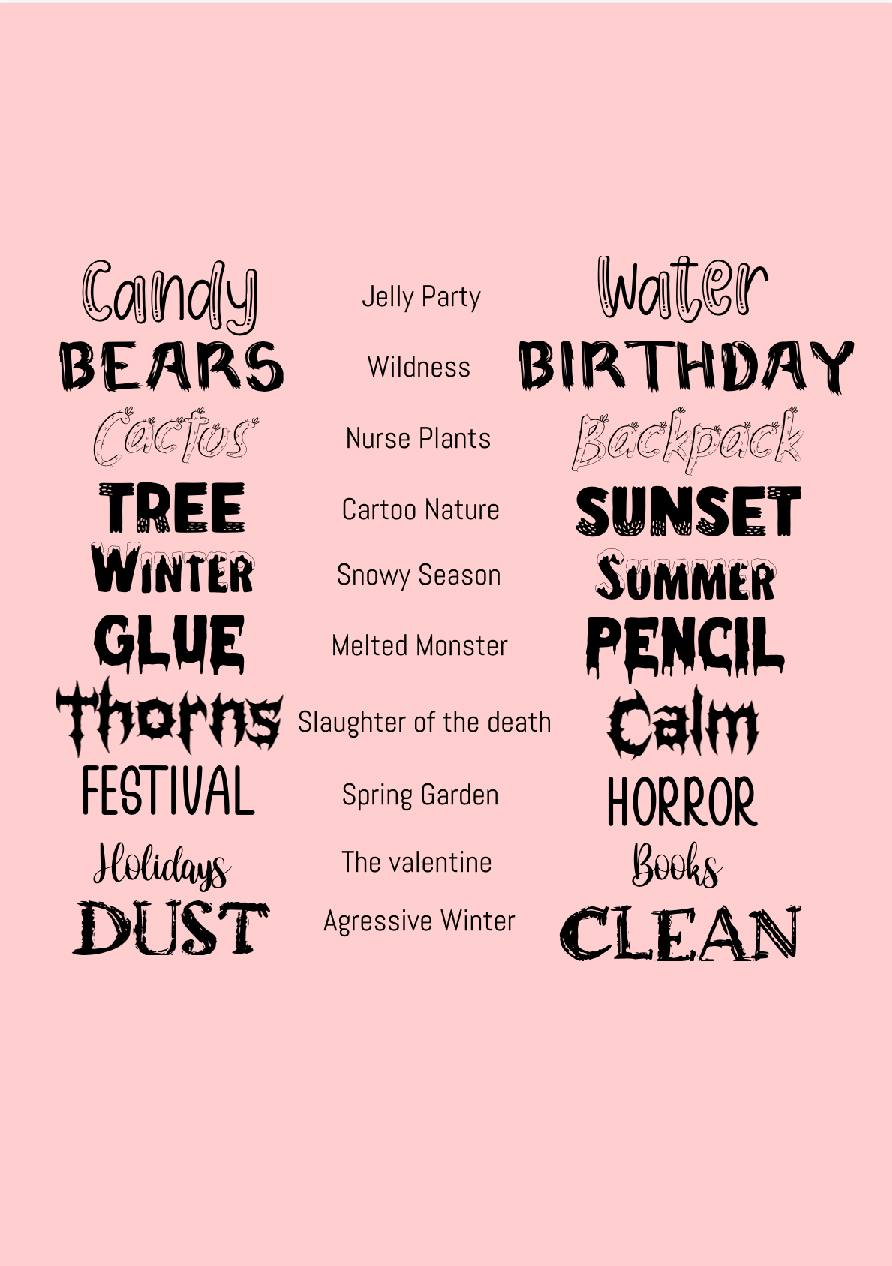 For the first image we had to learn about curves, straight lines, and corners and had to use that knowledge to outline the shapes, and also at the end we had to outline a spider. For the penny exercises we had to outline Abraham's head and shoulder and just isolate Abraham's head in 2 different ways. For the final illustration we had to cut out an image and paste it into a background. For my illustration, my background I chose was a sunset and I cut out a person looking down from the sun and 3 birds flying away from the person. I think the pen tool is a very helpful tool that helps you cut, crop, and trace images. One challenge I faced was I forgot to get the link of the background in the final illustration and I kept looking for it and I fixed it by getting a very similar image and getting the link for that one since I could not find the link for the first background. 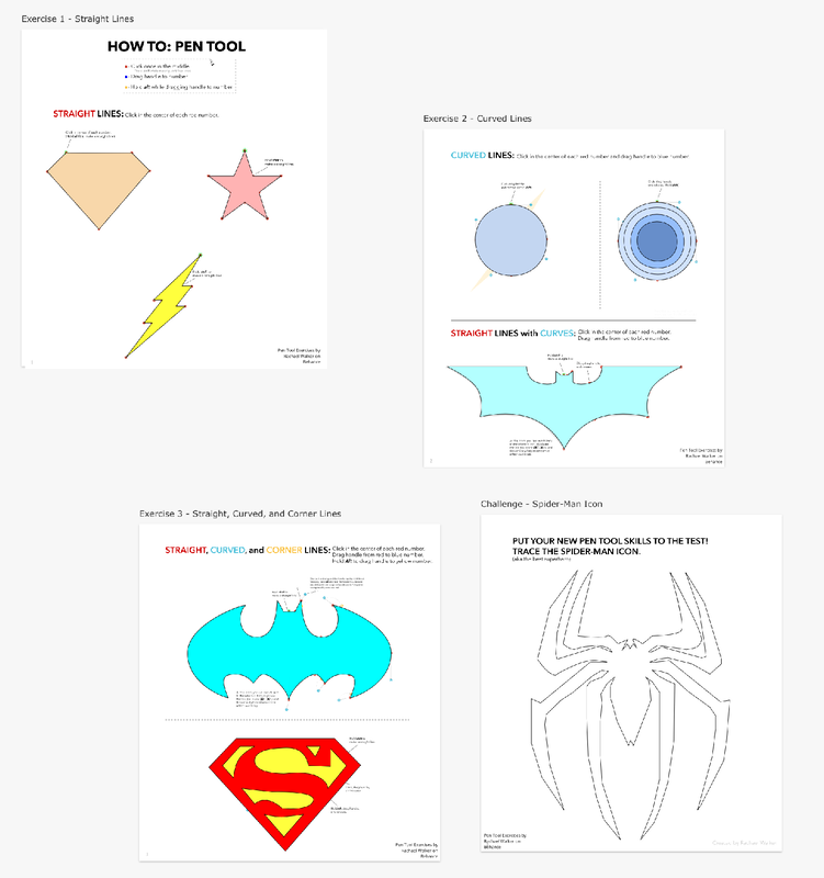 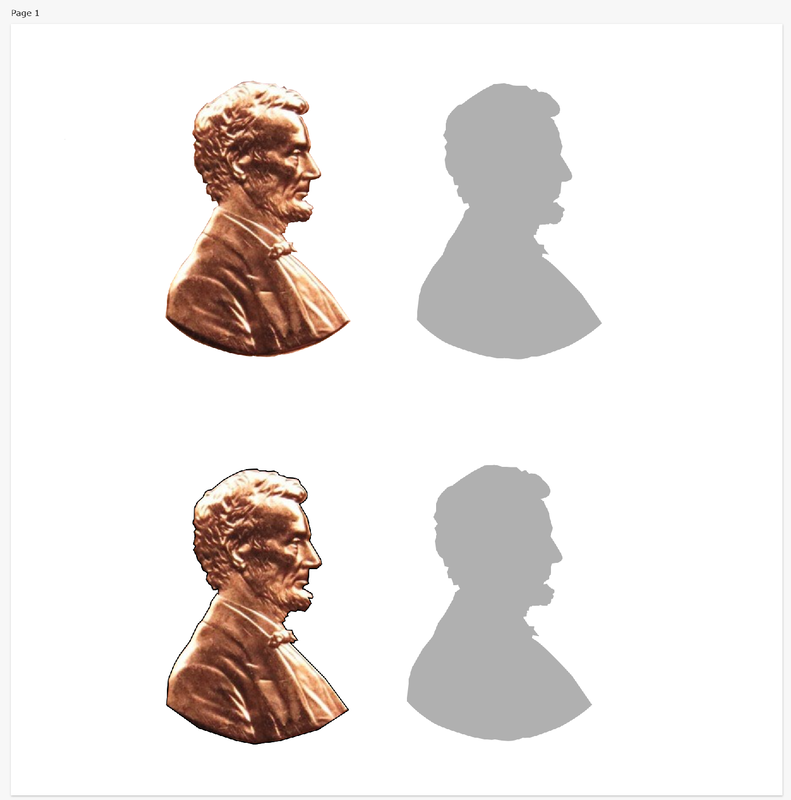 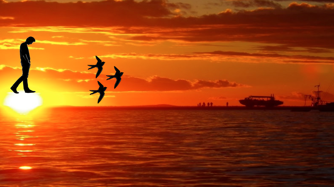 This picture is meaningful in many ways. The main reason is that this remind me a lot about Seoul because of all the buildings there is. Also in the winter time there is usually snow. Also, I have lived in Seoul most of my life and it is the city that I would call home. Also I really likes when it snows it is one of my favorite types of weather that happens in Korea as well as many other countries. These are some reasons why this picture is very meaningful to me. 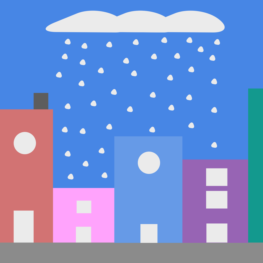 In this lesson I learned how to round the corners and change the amount of sides in each shape. 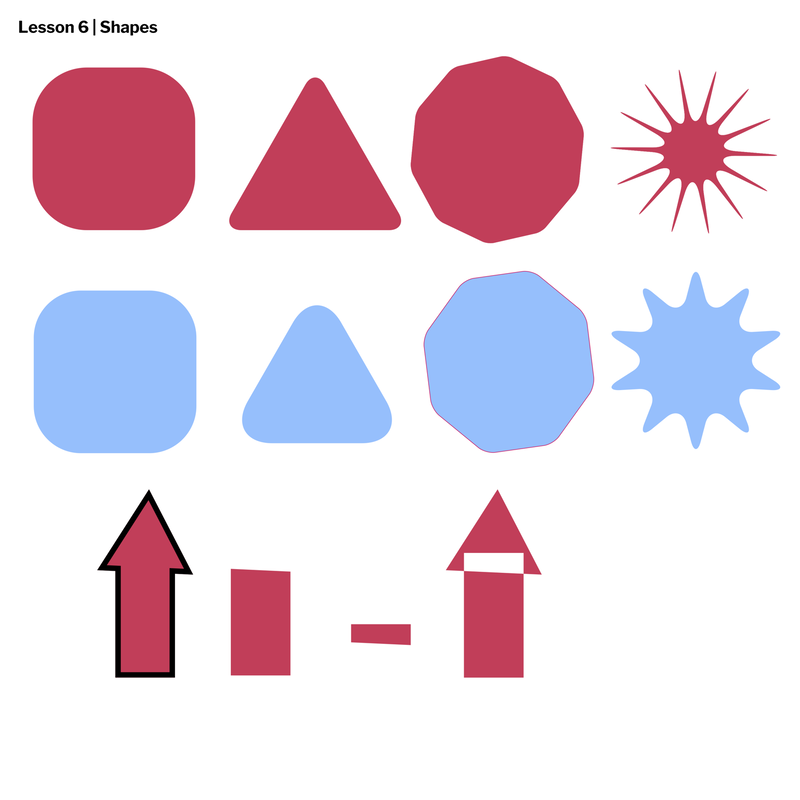 In this lesson I've learned how to adjust layers, group, and learned how to align shapes. I've learned a lot about the distribution tool that makes it really easy for me to align everything neatly. 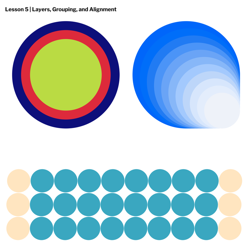 In this lesson I have learned how to create borders and that you can change the borders to a rounded corner, beveled corner, and mitered corner. I have also learned how to create dashed lines in the borders. 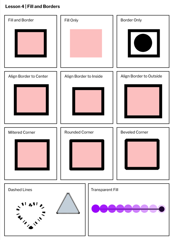 I have learned how to convert shapes into a path. I have also learned some keyboard shortcuts to do certain things like "V" makes it a pointer tool. 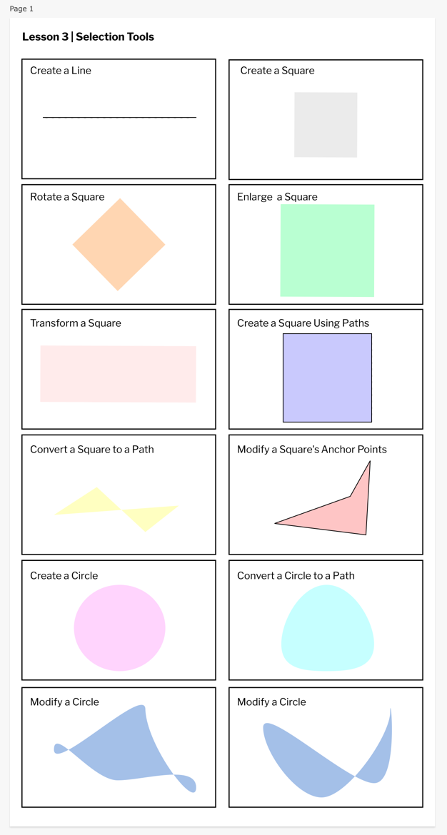 I have learned that there are many different sizes of pages in gravit that you can use. Also, I have learned that the keyboard shortcut for text in gravit is T. Finally, I have learned that you can add colors to your pages. 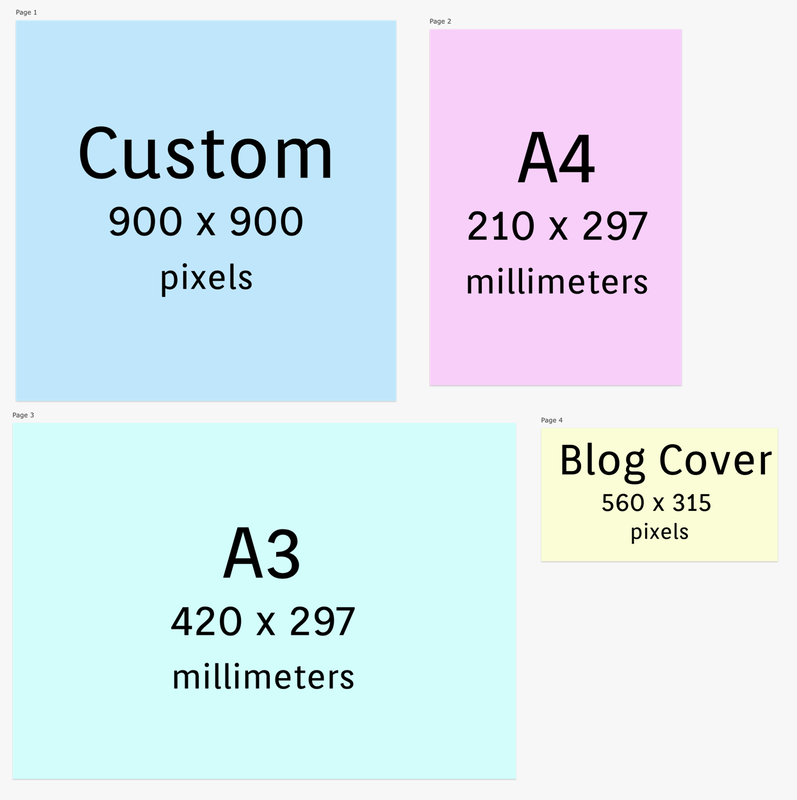 |
Archives
March 2021
Categories
All
 This work is licensed under a Creative Commons Attribution-NonCommercial-NoDerivatives 4.0 International License. |
